Explainer · Stock Charts
Candlestick charts for stocks, explained
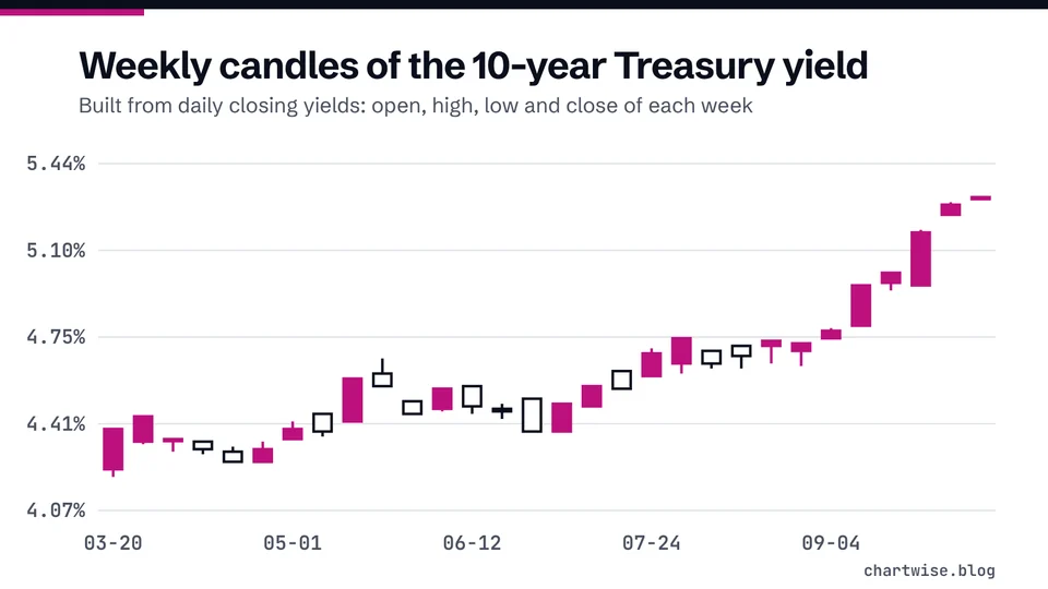
Each candle packs four prices into one shape: where the period opened, how high and low it went, and where it closed. Once you can read one candle, you can read the whole chart.
Quick answer
A candlestick shows four prices for one period: open, high, low and close [1]. The thick body spans the open and close; the thin wicks reach the high and low [2]. Green usually means the close was above the open, red below it. A candle describes the past, not the future [4].
Key points
- Body = open to close. Wicks = high and low for the same period [2].
- Color compares the close with that candle's own open, not with the previous day's close.
- Green and red are the common colors; Nasdaq's glossary uses white for up and black for down [1].
- One candle can cover 5 minutes, a day, a week or a month, depending on the chart setting [2].
- Pattern names describe shapes. Past performance cannot predict future results [4].
On this page
What is a candlestick chart?#
A candlestick chart is a way of charting price changes that displays an asset's opening, closing, high and low prices for each period [1]. Every period gets one candle. The candle has a box, called the real body, with a thin vertical line above and below it [1].
The body is the thicker middle part and shows the open and closing prices during the time frame. The wicks, also called shadows, are the thin lines at the top and bottom, and show the highest and lowest prices [2].
A candle holds the same four prices as a bar on an OHLC chart; only the drawing differs. A line chart, by contrast, keeps just the close for each period [2]. If axes and time windows are new to you, start with how to read a stock chart.
Here is how each part of a candle maps to a price. An up candle closed above its open; a down candle closed below it.
| Part of the candle | Up candle | Down candle |
|---|---|---|
| Top of the body | Close | Open |
| Bottom of the body | Open | Close |
| Tip of the upper wick | High of the period | High of the period |
| Tip of the lower wick | Low of the period | Low of the period |
| Usual color | Green (or white) | Red (or black) |
Body, wicks and colors: [2] and [1].
How do you read a single candle?#
Take one daily candle for a hypothetical stock. It opened at $50.20, traded as high as $51.85 and as low as $49.60, and closed at $51.40. Because the close is above the open, the body is drawn from $50.20 at the bottom to $51.40 at the top, and the candle is usually green [2].
- Read the body's ends
On an up candle the bottom is the open and the top is the close [1]: $50.20 and $51.40. The body is $1.20 tall (calculated).
- Read the wick tips
The top line shows the high and the bottom line the low [1]: $51.85 and $49.60. The full range is $2.25 (calculated).
- Compare body and wicks
Upper wick $0.45, lower wick $0.60 (calculated). The price traveled above and below where it ended, then settled near the top of the range.
- Put it in percent
From the $50.20 open to the $51.40 close is +2.39% (calculated). That is the move inside this one period only.
- Body (close minus open)
- $1.20$51.40 - $50.20, calculated
- Range (high minus low)
- $2.25$51.85 - $49.60, calculated
- Open to close
- +2.39%($51.40 - $50.20) / $50.20 x 100, calculated
Why can a red candle still be an up day?#
Candle color compares the close with the open of the same candle [2]. The daily change on a quote page is usually measured from the previous day's close instead. The two can disagree.
Suppose a hypothetical stock closed at $48.00 yesterday. Today it opens at $50.00 after good news, slips during the day and closes at $49.20. The candle is red, because the close is below the open [2]. Yet the stock finished the day higher than yesterday's close. See how to read a stock quote for how the daily change line works.
How much time does one candle cover?#
As much as you choose. A longer-term trader may track price on a weekly or monthly chart, while a shorter-term trader may use 60-minute or 5-minute charts [2]. The candle shape means the same thing at every setting: open, high, low and close for that slice of time.
On a daily chart of a U.S. stock, the regular session on the NYSE runs from 9:30 a.m. to 4:00 p.m. Eastern Time [3]. Some charting tools also show pre-market and after-hours trades, so check your settings if a candle's high or low looks odd.
The common settings and what one candle covers:
| Candle setting | One candle covers | Typical use |
|---|---|---|
| 5-minute candles | Five minutes of trading | Very short-term trading |
| 60-minute candles | One hour of trading | Short-term trading |
| Daily candles | One trading session | Following a stock over months |
| Weekly candles | One trading week | Longer-term view |
| Monthly candles | One calendar month | Years of history on one screen |
Time frames used by shorter- and longer-term traders: [2].
What do candlestick patterns like doji or hammer claim to show?#
Traders give names to candle shapes. A doji is a candle with almost no body, because the open and close are nearly the same. A hammer has a small body near the top of the range and a long lower wick. These names describe what already happened inside one period, using the same four prices as any other candle.
What the names do not do is predict. Some books and websites attach meanings such as "reversal" to shapes, but the SEC is clear that past performance cannot predict how an investment strategy will perform in the future [4], and that back-tested performance is hypothetical and does not reflect actual performance [4]. Treat any claim that a pattern "works" a set percentage of the time with that in mind. Academic researchers who tested chart patterns on U.S. stocks from 1962 to 1996 pointed out that shapes on price charts are often in the eyes of the beholder [5]. They found that several indicators may have some practical value [5], a hedged result that does not claim profits after trading costs.
Our explainer on support and resistance covers another chart idea that is often overstated.
Mistakes beginners make with candlestick charts#
- Reading red as "down for the day"
Color compares close with the same candle's open [2]. In our example a red candle came on a +2.5% day (calculated).
- Mixing up the ends of the body
On an up candle the open is at the bottom; on a down candle the open is at the top [1].
- Ignoring the time setting
A 5-minute candle and a weekly candle look identical in shape but cover very different spans [2].
- Treating a pattern name as a forecast
A shape describes the past. Past performance cannot predict future results [4].
- Skipping volume
Check the volume strip under the candles to see whether a long candle came on heavy or light trading.
Frequently asked questions#
What do green and red candles mean?
What are the thin lines on a candlestick?
They are wicks, or shadows. The top one reaches the period's high and the bottom one reaches the low [1].
Are candlestick charts better than line charts?
They show more detail for each period, while a line chart gives a quicker view of the longer-term trend [2]. Many readers use both.
Can candlestick patterns predict stock prices?
No pattern can. Past performance cannot predict how an investment strategy will perform in the future [4].
The bottom line#
A candlestick is four prices in one shape: open and close in the body, high and low at the wick tips. Read the color against that candle's own open, not yesterday's close, and always check what span of time one candle covers. Named patterns are labels for shapes, not forecasts. Next, see how moving averages summarize many candles into one line, or go back to the stock charts hub.
Sources
Education only. This page is not investment, tax or legal advice. Stocks can lose value. See our risk disclosure.