Explainer · Stock Charts
How to read a stock chart for beginners
A stock chart is a record of prices people already paid. Learn to read its axes, its time frame and its scale, and you will see what happened without mistaking it for what comes next.
Quick answer
A stock chart plots price on the vertical axis against time on the horizontal axis. A line chart joins closing prices [1]; bars and candlesticks add the open, high and low [5]. Check the time frame and scale first. A chart shows the past, which cannot predict future results [8].
Key points
- Price runs up the side, time runs along the bottom. Each point covers one period, such as a day or a week.
- A line chart shows closing prices; bar and candlestick charts also show the open, high and low [1].
- The same stock can be up over one window and down over another. In our hypothetical example it is -4.79% over one month and +16.88% over one year (calculated).
- On a log scale, equal percentage moves look equal. On a linear scale, equal dollar moves look equal.
- Past performance cannot predict how an investment strategy will perform in the future [8].
On this page
What does a stock chart actually show?#
A stock chart is a picture of trades that already happened. The vertical axis shows the share price in dollars. The horizontal axis shows time, from older on the left to newer on the right. Each point, bar or candle covers one period, and you choose the period: a longer-term trader may track price on a weekly or monthly chart, while a shorter-term trader may use 60-minute or 5-minute charts [1].
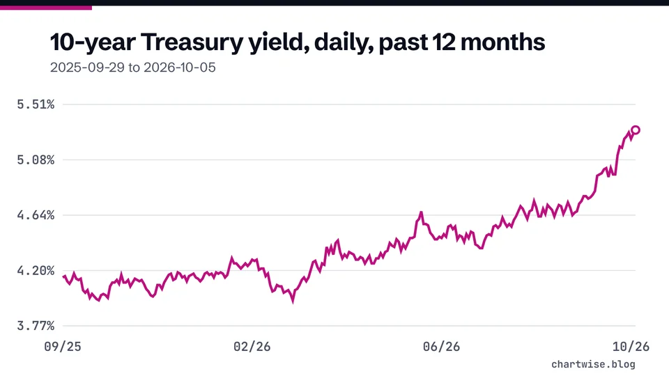
The simplest view is a line chart, which shows the closing price for each period [1]. On a daily chart of a U.S. stock, the close usually refers to the end of the regular session, which on the NYSE runs from 9:30 a.m. to 4:00 p.m. Eastern Time [2]. Nasdaq sets an official closing price through its Closing Cross at 4:00 p.m. [3]. Data providers may not all plot the same closing price, so a close on one site can differ slightly from another.
Many charts also show volume as a strip of bars along the bottom. Volume is the number of shares traded, counted once per trade: if A sells 100 shares to B, volume is 100 shares [4]. Our guide to volume and average volume explains how to read that strip.
Here are the parts you will find on almost every stock chart and what each one tells you.
| Part of the chart | What it shows | What to check |
|---|---|---|
| Vertical axis (price) | Share price in dollars | Linear or log scale |
| Horizontal axis (time) | Dates or times, older to newer | Which window is selected |
| Line, bar or candle | Price for one period | Close only, or open, high, low and close |
| Volume strip | Shares traded per period | Whether a move came on busy or quiet trading |
| Overlay lines | Indicators such as moving averages | Which settings were used |
Chart types and what they plot: [1]. Volume definition: [4].
Which chart type should a beginner start with?#
Start with a line chart. It gives a quick way to see a longer-term trend [1], and it has only one price per period, the close.
A bar chart, often called an OHLC chart, adds three more prices. The opening price is a small tick to the left, the closing price a tick to the right, and the vertical line runs from the high to the low [1].
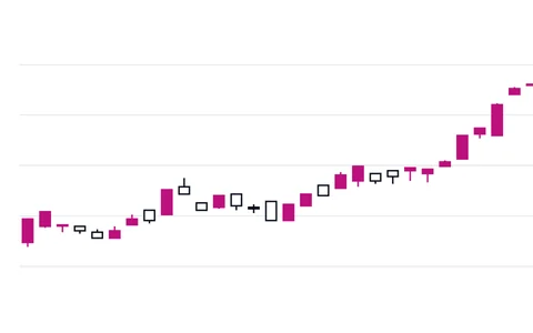
A candlestick chart shows the same four prices in a different shape. The thick body covers the open and the close, and the thin wicks above and below reach the high and the low [1]. When the close is above the open, the candle is generally green; when the close is below the open, it is generally red [1]. Nasdaq's glossary describes the same idea with white and black bodies [5]. Our candlestick chart guide walks through one candle step by step.
How does the time frame change the story?#
The window you pick decides what the chart seems to say. Take a hypothetical company whose shares close today at $46.75. Measured from different starting points, the same price is a gain or a loss.
The table shows the starting price for each window and the percentage change to today, worked out as the change divided by the starting value, times 100 [6].
| Window | Starting price | Change to $46.75 |
|---|---|---|
| Last 5 trading days | $46.20 | +1.19% |
| Last 1 month | $49.10 | -4.79% |
| Last 3 months | $52.40 | -10.78% |
| Last 1 year | $40.00 | +16.88% |
Hypothetical stock. Percentage changes calculated in code with the BLS percent-change method [6].
None of these windows is the true one. A headline that says a stock "crashed" may be looking at three months; a headline that says it "soared" may be looking at a year. Before you react to any chart, read the window label. You can check any two prices yourself with our percentage change calculator.
How do you read a stock chart step by step?#
- Confirm the ticker and the chart type
Make sure you are looking at the right company and know whether the chart shows closes only (line) or open, high, low and close (bars or candles) [1].
- Read the time window and the period
A one-year chart of daily candles and a one-day chart of 5-minute candles are different tools. Pick the one that matches your question.
- Check the price scale
On a linear scale equal dollar moves look equal. On a log scale equal percentage moves look equal. The next section shows why that matters.
- Turn the move into a percentage
Take the first and last price in the window and work out the percentage change [6]. From $40.00 to $46.75 is +16.88% (calculated).
- Check volume and events
See whether big moves came with heavy trading, and look for earnings dates, news or a stock split in the company's filings before guessing at a reason.
Why can the same move look big on one chart and small on another?#
The price scale changes how moves look. On a linear scale, every $10 takes up the same height. A rise from $10 to $20 and a rise from $100 to $110 look the same size, yet the first is +100% and the second is +10% (calculated). On a log scale, equal percentage changes take up equal height, so the first move is drawn about 7.27 times taller than the second (calculated). For long histories where the price has multiplied, a log scale shows the size of each move in percentage terms.
Stock splits can also fool the eye. A stock split increases the number of shares without changing shareholders' equity [7]. In the SEC's example, 100 shares at $100 become 200 shares at $50 after a two-for-one split [7]. A chart that does not adjust for the split shows a cliff that was never a loss. Check whether your chart says its prices are adjusted for splits, and look for a sudden halving or doubling before you read it as a crash or a jump.
- $10 to $20
- +100%($20 - $10) / $10 x 100, calculated
- $100 to $110
- +10%($110 - $100) / $100 x 100, calculated
- Height on a linear scale
- Sameboth moves are $10
What can a stock chart not tell you?#
A chart cannot tell you what happens next. The SEC is direct about this: past performance cannot predict how an investment strategy will perform in the future [8]. Any stock can fall, and there is no assurance the company will grow and do well, so you can lose money you invest in stocks [9].
A chart also says nothing about why a price moved. It does not show the company's revenue, debt or cash. For that you need the company's filings, which you can find on the SEC's EDGAR system [9].
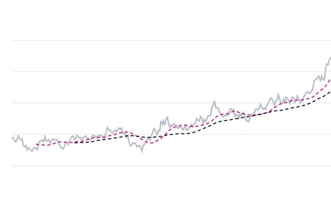
Charts of a whole market are read the same way. Investor.gov describes a bear market as generally a fall of 20% or more in a broad market index over at least a two-month period [10], and a bull market as a rise of 20% or more over at least two months [11]. See the bear market and bull market definitions. Lines drawn on top of price, such as 50-day and 200-day moving averages, summarize the past too.
Mistakes beginners make with stock charts#
- Ignoring the time window
The same price was -10.78% over three months and +16.88% over a year in our example (calculated). Read the window label first.
- Reading a split as a crash
A two-for-one split halves the price per share and doubles the share count [7]. Check for splits before reacting to a cliff.
- Comparing dollar moves instead of percentages
A $10 move is +100% on a $10 stock and +10% on a $100 stock (calculated). Convert to percent before comparing.
- Treating the chart as a forecast
Past performance cannot predict future results [8]. A rising line is a record, not a promise.
- Forgetting the company behind the ticker
A chart shows trades, not the business. Read the company's filings on EDGAR as well [9].
Frequently asked questions#
What is the easiest stock chart for a beginner?
A line chart. It shows the closing price for each period [1], so there is only one number per point. Move to candlesticks once the axes and time frames feel familiar.
What do the bars at the bottom of a stock chart mean?
They usually show volume: the number of shares traded in each period, counted once per trade [4].
Should I use a log or a linear scale?
For long periods where the price has risen many times over, a log scale shows percentage moves at equal height. When the price has moved only a little within the window, the two scales look almost the same.
Can a stock chart predict the price?
No. Past performance cannot predict how an investment strategy will perform in the future [8].
The bottom line#
Read every stock chart in the same order: ticker, chart type, time window, scale, the percentage change, then volume and events such as splits. That routine stops the most common misreadings, like a split mistaken for a crash or a three-month dip mistaken for a long decline. Keep in mind that a chart is a record of the past and says nothing certain about the future. Next, learn the detail inside each period with candlestick charts, or return to the stock charts hub.
Sources
- Chart Types: candlestick, line, bar.
- Holidays & Trading Hours.
- The Nasdaq Opening and Closing Crosses (FAQ).
- Trading volume Definition.
- Candlestick chart Definition.
- Calculating percent changes : U.S. Bureau of Labor Statistics.
- Stock Split.
- Investor Bulletin: Performance Claims.
- Stocks - FAQs.
- Bear Market.
- Bull Market.
- Day Trading: Your Dollars at Risk.
Education only. This page is not investment, tax or legal advice. Stocks can lose value. See our risk disclosure.